This tutorial explains how to create a simple pattern, then how to use it along with a couple of layer styles to make a chocolate bar like text effect. It then explains how to modify a simple brush to add a nice filling to the text, and finally, adding some adjustment layers to complete the effect.
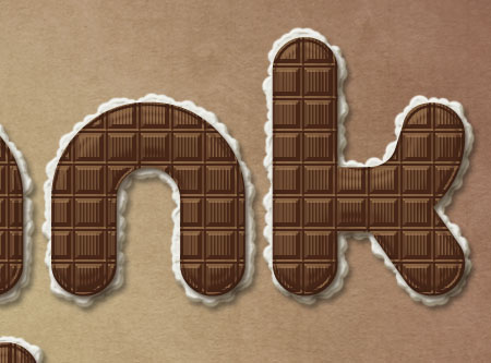
The Final Result:

Notes:
* the software used in this tutorial is Adobe Photoshop CS5 Extended
* the size of the final result image is 1250 * 800
* you might want to check the Basix Page to see some useful topics on dealing with Photoshop basics, such as loading palettes and some shortcuts.
* the size of the final result image is 1250 * 800
* you might want to check the Basix Page to see some useful topics on dealing with Photoshop basics, such as loading palettes and some shortcuts.
Resources:
The tutorial explains how to create the pattern to show some useful tips and tricks, but here is the pattern if you want to skip that.
* Pattern used.
* Yellow Vintage Paper Texture from the Colored Vintage Paper: Texture Pack
* Bows Set 2 by ~ro-stock.
* Yellow Vintage Paper Texture from the Colored Vintage Paper: Texture Pack
* Bows Set 2 by ~ro-stock.
A Special Thank You!
To all textuts‘ readers, followers, subscribers, and fans. I really appreciate your amazing support, and it means a lot to me. July 22nd was textuts‘ first anniversary, and I thought I’d take this opportunity to thank you all for making this happen!
I always love to hear from you, so if you’ve got anything you’d like to say or suggest, just go ahead and send me a message through the contact form.
This text effect is a simple “Thank You”, so I hope you like it 
Best regards,
Rose
Rose
Step 1:
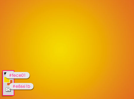
- Set the Foreground color to #fece01, and the Background color to #e8661b, and create a Radial Gradient from the center of the document to one of the corners.
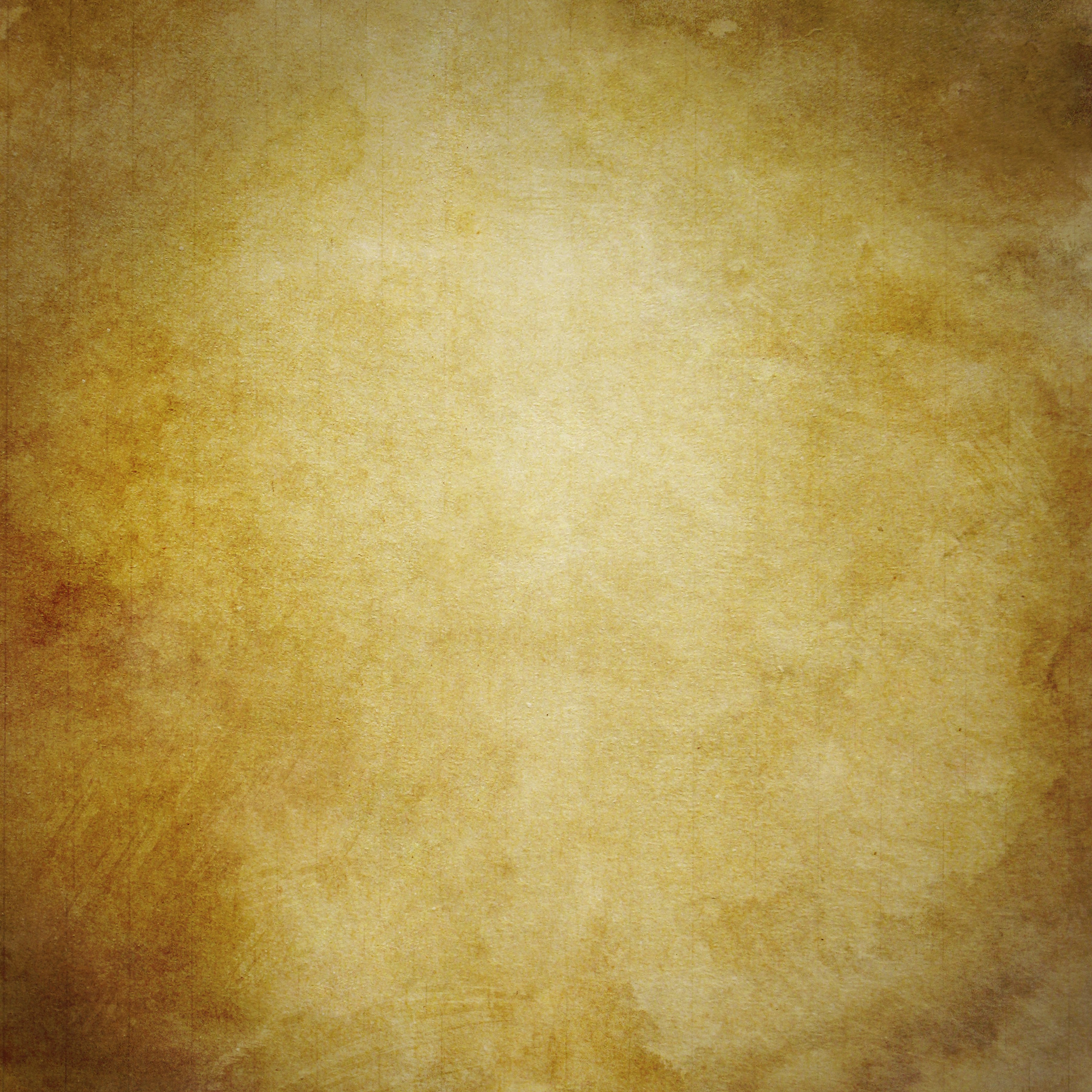
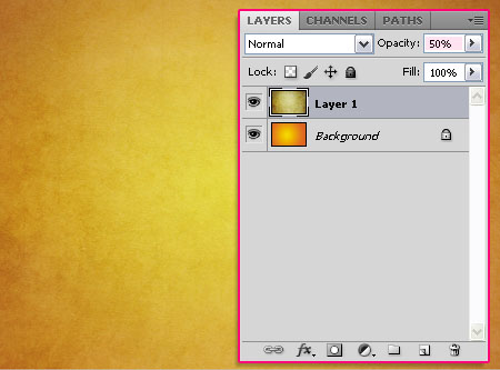
- Place the Yellow Vintage Paper Texture on top of the Background layer, scale it down till it fits properly in the document, and change its Opacity value to 50%.
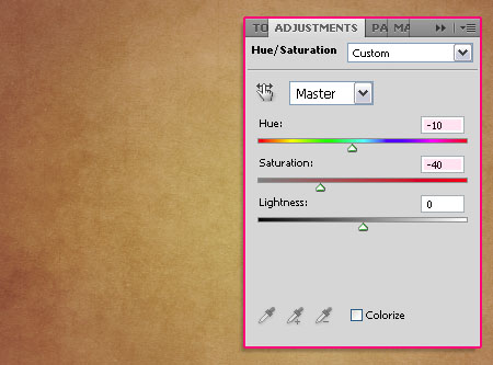
- Click the New Adjustment Layer icon at the bottom of the Layers panel, and choose the Hue/Saturation adjustment layer.
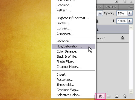
- Change the Hue value to -10 and the Saturation value to -40.
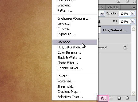
- Again, click the New Adjustment Layers icon, this time, choose the Vibranceadjustment layer.
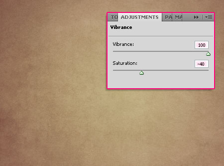
- Change the Vibrance value to 100 and the Saturation value to -40.
Step 2:
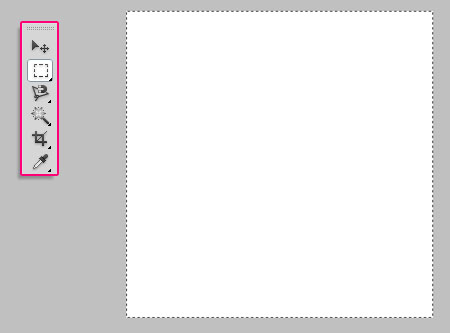
- We are going to create the Pattern right now. So open a new document that is 30 x 30px with a White Background. You can zoom in until the document is big enough to work with.

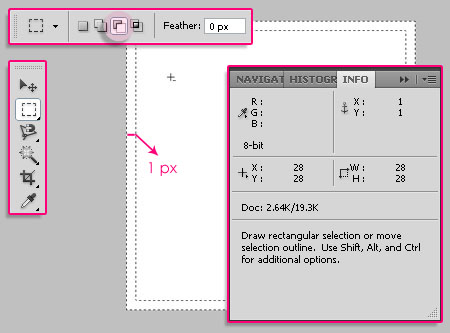
- Using the Rectangular Marquee Tool, draw a square that selects the whole document.
- Click the Subtract From Selection icon in the Options Bar, and draw another rectangle that is 1px smaller than the first one.
* You can open the Info Panel (Window -> Info) to check the dimensions.
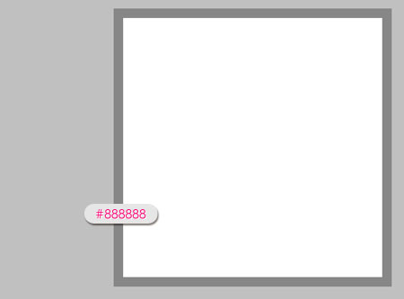
- Fill the selection with the color #888888.
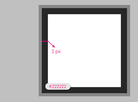
- Press Ctrl+D to get rid of the selection, then, repeat a similar process, but this time, draw the first rectangle so that it selects the white area only, and the other one should be 2pxsmaller. Fill the selection with the color #222222.
- Once again, draw another border that is 2px wide, and fill it with the color #c7c7c7.
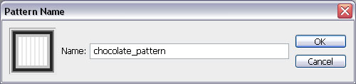
- Now, go to Edit -> Define Pattern, and type in a name for the pattern.
Step 3:
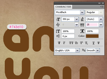
- Back to the original document, create the text with the color #743d10. The font used isPicoBlack, and the Size is 350px. Also, set the Tracking value to 25 to avoid overlapping.(You can get the Character panel from Window -> Character).
- Duplicate the text layer(s).
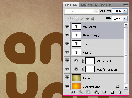
- If you have multiple text layers, select all of the duplicated ones, then go to Layer -> Merge Layers, or simply press Ctrl + E. If you have only one text layer, the right click it, and choose Resterize Type.
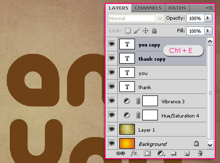
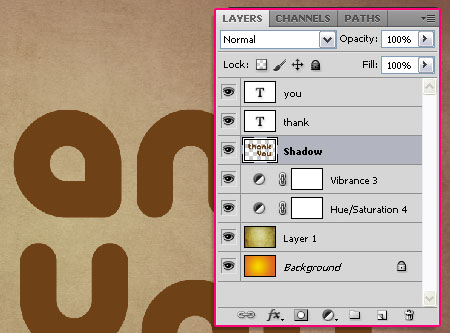
- Drag the merged/ rasterized layer so that it becomes under the original text layer(s), and rename it to “Shadow”. We are going to use this later to create a shadow using the Motion Blur filter.
Step 4:
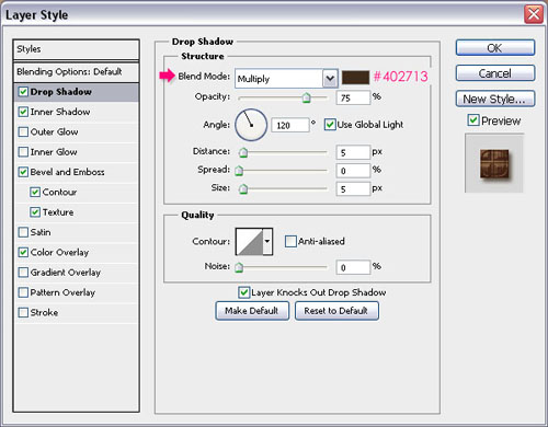
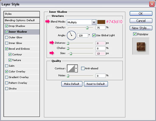
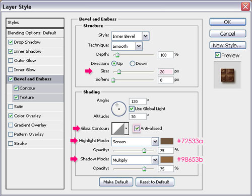
Double click on the original text layer to apply the following styles:
- Drop Shadow: Just change the color to #402713.
- Inner Shadow: Change the color to #743d10, the Distance to 0, and the Size to 13.
- Bevel and Emboss: Change the Size to 20, check the Anti-aliased box, change theHighlight Mode color to #72533a, and the Shadow Mode color to #98653b.
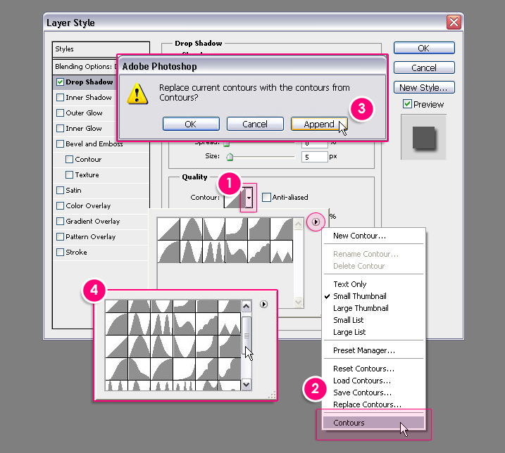
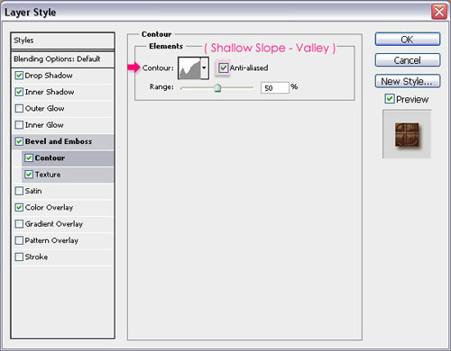
- Contour: Change the Contour to Shallow Slop – Valley, this will create a simple border around the beveled text, so that the text won’t look flat at the edges. Check theAnti-aliased box for a smoother result.
Check this image to see how to load the contours if you don’t have them.
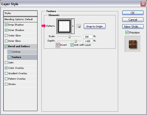
- Texture: Here is where we are going to give the text the chocolate bar look using the pattern we’ve created in Step 2. So go ahead and choose the chocolate_pattern from thePattern box, and check the Invert box. You can change the Depth value if you like, but it is set to its default here.
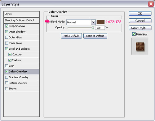
- Color Overlay: This is optional, but it is where you can choose a color for the chocolate. The color used here is #673d26, but you can totally go ahead and choose a different color.
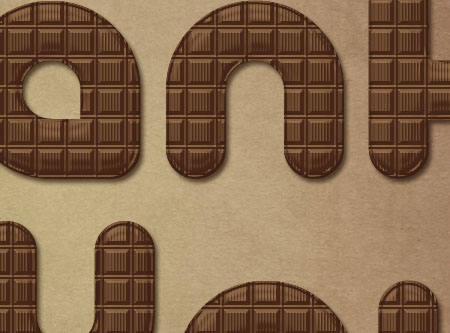
- Click OK to get out of the Layer Style box. Check out what we’ve got!
Step 5:
Open the Brush panel (Window -> Brush), choose a hard round brush, and modify its settings as shown below:
- Brush Tip Shape:
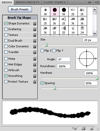
- Shape Dynamics:
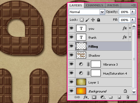
- Create a new layer on top of the “Shadow” layer and under the text layer(s), call it “Filling”.
- Right click on the text layer, and choose Create Work Path.
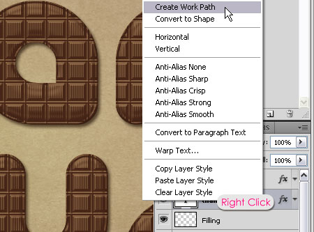
- Select the “Filling” layer so that it is the active layer, then, pick the Direct Selection Tool and set the Foreground color to White. Right click on the path and choose Stroke Path.
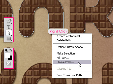
- Choose Brush from the Tool drop down menu, and un-check the Simulate Pressurebox.
This will stroke the path with the brush. Hit Enter to get rid of the path.
Step 6:
Double click on the “Filling” layer to add the following styles:
- Drop Shadow: Just change the color to #787878.
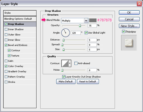
- Bevel and Emboss: Change the Gloss Contour to Rounded Steps, check the Anti-aliased box, change the Highlight Mode to Overlay, and the Shadow Mode color to#99846b.
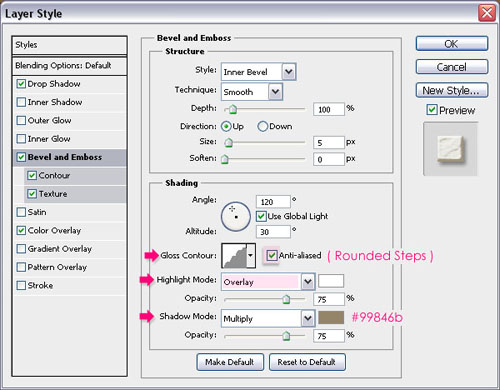
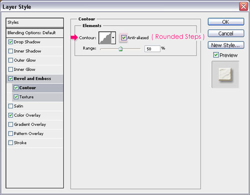
- Contour: Change the Contour to Rounded Steps as well, and check the Anti-aliasedbox.
Check this image to see how to load the contours if you don’t have them.
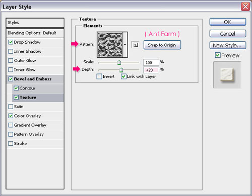
- Texture: This will add a simple texture to the filling so that it looks more 3D. So chooseAnt Farm from the Pattern box, and change the Depth value to 20.
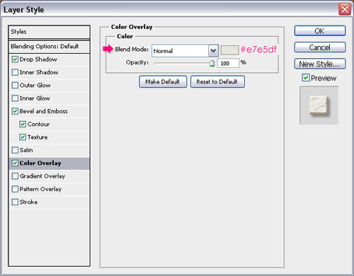
- Color Overlay: This is also optional, but you can choose a color for the Filling as well. The color used here is #e7e5df, but you can choose any other color you like.
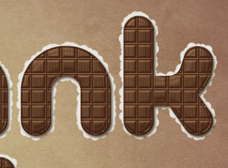
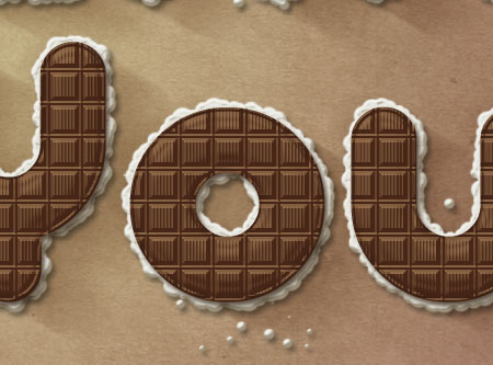
- This is what the filling should look like.
Step 7:
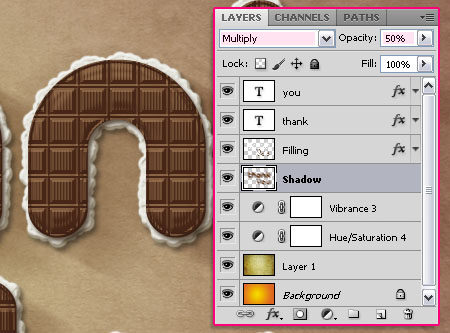
- Select the “Shadow” layer we created earlier, and go to Filter -> Blur -> Motion Blur. Change the Angle to -30 and the Distance to 100.
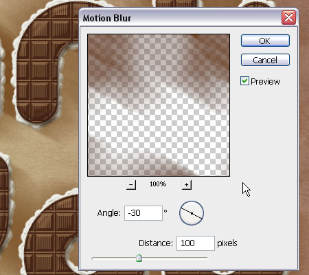
- Move the shadow around (using the Move Tool) so that it starts at the top edge of the letters, and spreads away diagonally. Change the “Shadow” layer’s Blend Mode toMultiply, and the Opacity to 50%.
This should give the text more depth.
Step 8:
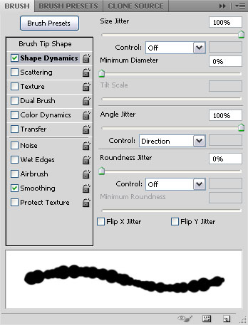
Go back to the Brush panel, and using the same hard round brush, modify the settings as shown below:
- Brush Tip Shape:
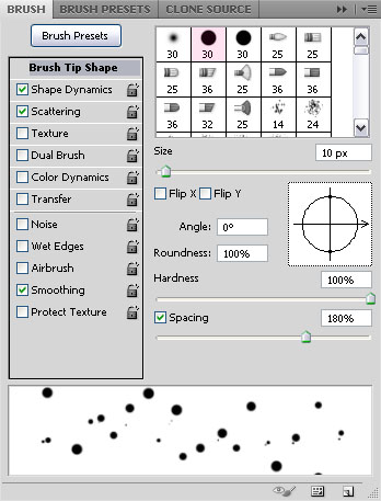
- Shape Dynamice:
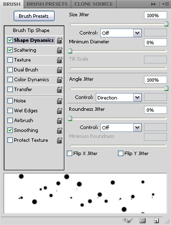
- Scattering:
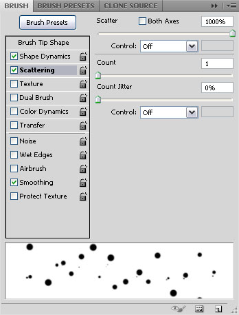
Now, start painting some scattered dots on the “Filling” layer, as if the filling is a bit spread around the text.
Step 9:
- Open a bow form the Bows Set 2, and place it on top of all layers. Resize it and move it or rotate it till you like how it looks, and place it on top of one of the letters.

Double click on the “Bow” layer to apply the following styles:
- Drop Shadow: Change the color to #805748, and the Size to 11.
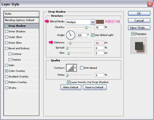
- Color Overlay: Change the Blend Mode to Soft Light and the color to #696149.
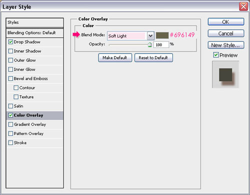
This should enhance the color of the bow and give it more depth.

- Go to Image -> Adjustments -> Hue/Saturation, change the Hue to 5 and theSaturation to -10.
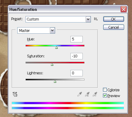
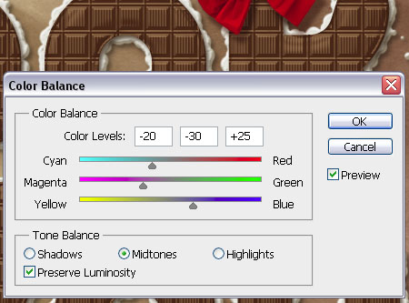
- The color of the bow is getting better, but it still needs some more adjustments. So go toImage -> Adjustments -> Color Balance, make sure that the Tone Balance is set toMidtones, and change the Color Levels values as shown below:
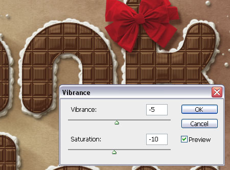
- Finally, go to Image -> Adjustments -> Vibrance, set the Vibrance to -5 and theSaturation to -10.
Step 10:
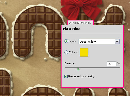
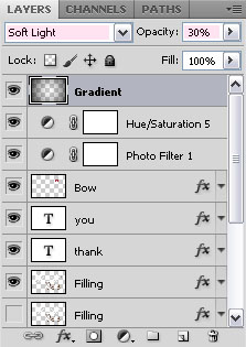
- The last thing we’re going to do is adding some adjustment layers to make everything blend well. So click the New Adjustment Layer icon, and choose Photo Filter.
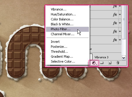
- Choose the Deep Yellow Filter from the drop down menu.
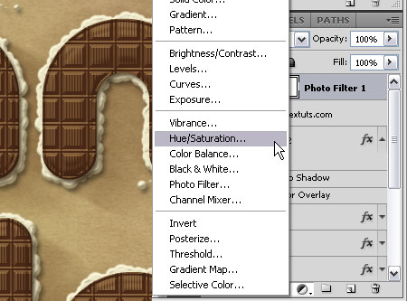
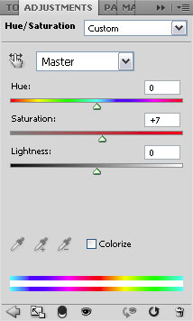
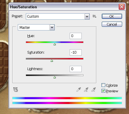
- Add a Hue/Saturation adjustments layer, and set the values as below:
- You might as well need to adjust the colors of the “Bow”. The only adjustment made here is changing the Saturation (Image -> Adjustments -> Hue/Saturation) value once again, to make the colors a bit less bright. But you can go ahead and do whatever adjustments you’d like to do.
- Finally, set the Foreground color to Black, create a new layer on top of all layers and call it “Gradient”, then, create a Foreground to Transparent Radial Gradient. Change the layer’s Blend Mode to Soft Light, and its Fill value to 30%.
And that’s it!
copied from http://textuts.com
This comment has been removed by the author.
ReplyDeleteReally Impressive!, simple but beautiful.
ReplyDelete